
Document Content
Readable preview with adjustable font size and wrap control.
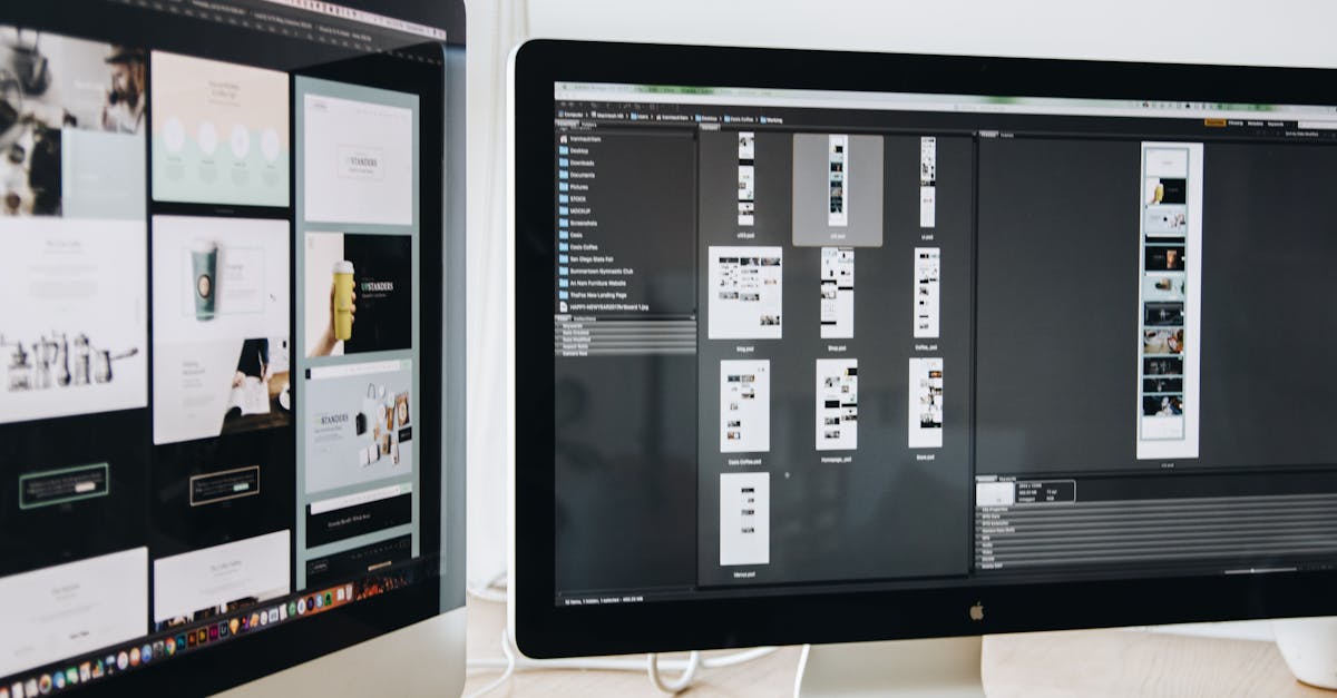
Elements of Web 2.0 Graphics

Web 2.0 has created a revolution on the internet in a
number of ways. There’s the collaboration factor which
enabled people to share information much easier than
before.

Then there’s the factor of bringing the desktop environment
to the internet. But nothing’s more obvious in the Web 2.0
world than the so-called Web 2.0 design.

What makes a Web 2.0 design different from the designs of
the past? Here are some of the elements that set it apart
from everything that has come before it.

1. Rounded boxes

- although this has been used in designs of the past, this
design element wasn’t used extensively until Web 2.0 came.
This helps give a fresh look into websites which used to be
dominated by very professional-looking rectangular boxes.

2. Reflections

- this element aims to give off a 3D look for icons.
However, this is to be used sparingly, only to be used to
give depth to otherwise plain-looking icons.

3. Whitespace

- in web designs of old, having a lot of whitespace was a
no-no. Information was to be packed in as much space as
possible. But not anymore in the Web 2.0 world. Having a
lot of whitespace on a design makes it possible to read
things on-screen without causing too much eye strain. Aside
from that, it sets borders among elements without actually
creating a demarcating line.

4. Large fonts

- immediately capture one’s attention. Large fonts are
therefore useful in highlighting important parts of the
webpage especially the headlines and the banners.